
From factory
to frontend
ROLE
Product Designer
TIMELINE
2021, 3 weeks
TOOLS
Figma (Wireframing, Lo & Hi )
Keyshot (Product Renders )
TEAM
Aniruddha Doke (Designer)
Nikhil Thomas (Designer)
client
Sine Automation (also known as 'Sineclad') is a Mumbai, India-based B2B manufacturer and provider of advanced welding automation technologies, with a decade of experience and over 100 systems commissioned. They specialize in weld overlay cladding systems, automation for vessel fabrication, butt welding, and custom special purpose machines for global clients, particularly in the oil & gas industry.
challenge
Sine Automation needed a digital presence that matched the sophistication of their machines. Their existing website was outdated and underselling their expertise. The goal was to redesign it into a modern, impactful platform that establishes global credibility, communicates their precision and values, and builds trust with both technical users and business clients.
contribution
I led UX and visual direction, building a story-driven platform rooted in user behavior and brand authenticity. I developed a cohesive design system, introduced dual navigation for browsing, and crafted user flows and wireframes that balanced technical depth with brand storytelling, positioning SINE as both credible and competitive in the global market.
I collaborated closely with Aniruddha Doke, a fellow designer on the project. While I focused on UX flows, layout structure, and the overarching visual strategy, Doke contributed to UI detailing and component-level refinement. We worked iteratively, reviewing each other’s work to maintain consistency and alignment across the experience.
This project shows how thoughtful design can impact businesses, with SINE reporting a 45% rise in web traffic and 32% increase in sales
what client said
“I want a modern looking website”
what we heard
“We need a redesign of our website that captures the essence of SINE Automation. Something that convinces prospective clients of both what we offer and what we're capable of.”
what we asked
“Who are your clients and what do you want them to care about when they visit your website?”
Overview
SINE Automation’s outdated website failed to reflect their growth and technical expertise. Our goal was to transform it into a platform that builds trust and showcases capabilities for diverse user goals. This meant grounding the design in real-world context through a factory visit, introducing a dual-navigation model, and establishing a visual identity through layout, imagery, and story

Factory visit
On-site visit absorbing the environment, brand personality and people

Vale added
scope expansion
Proposing 3D product renders to elevate digital impact
Dual navigation
strategy
Introducing double navigation tailored to audience needs

Key Takeaways
What we learned about industrial clients and designing trust
Understanding the Heart of the Machine
We walked the factory floor, met the welders, engineers, and observed the machines in action. This wasn’t just research; it was about capturing the soul of the company. The dirt, the weld sparks, and the scale of the machinery directly inspired our layout, textures, and colors.

Website audit


Clarity over clutter
PROBLEM : The old site lacks a clear visual hierarchy. Fonts, buttons, and section headers are small, and content is too text-heavy with poor visual flow.
IMPACT : Users can’t quickly grasp the key offerings or what to do next.
SOLUTION : The new site uses bold, modern typography, strong contrast, and large headers to establish a visual flow. and bold CTAs to guide user attention and improve scanability.
Telling the brand story
PROBLEM : The old site doesn’t communicate the brand’s essence visually. It’s utilitarian, with generic and varied fonts, minimal personality, and uninspiring images.
IMPACT : Potential clients can’t get a sense of the company’s values or professionalism.
SOLUTION : Strong visual identity through on-brand imagery, a hero section showing real machinery, and even on-site photography. Brand voice is confident and focused on trust and expertise.
Imagery & Media Use
PROBLEM : Most product visuals are outdated CAD-style snapshot with no context or scale.
IMPACT : Users can’t understand how the machines work or how impressive they are in real.
SOLUTION : Replaced with Keyshot renders that captured real colors and textures that show scale, context, and use. This shift enhances credibility and storytelling.
Competitor Research
We studied global leaders like IRCO, LJ Welding, Fronius, and Gullco. While some showcased precision, most lacked warmth or narrative. Our insight: SINE’s advantage wasn’t just machinery , it was the story. That led to a bolder visual strategy, integrating real imagery with clean structure.

Wireframes
Wireframes focused on scannability, clean visual hierarchy, and balancing two distinct user types - engineers and system buyers.

Design System
White
White serves as a grounding neutral that symbolizes clarity, professionalism, and transparency , key values in SINE’s identity. It also enhances usability, ensuring that content remains readable and accessible
#FFFFFF
Smoky black to Dark umber
This earthy gradient evokes the factory’s physical location (on the muddy outskirts) and metaphorically connects to the company’s humble beginnings. The gradient also echoes the light of welding falling onto the ground, captured in on-site photography.
#140700
#513323
Flame orange
This bold orange is directly drawn from SINE’s machinery and logo, acting as a signature accent. It reflects energy, industrial precision, and brand continuity, appearing strategically in buttons, icons, and highlight elements
#EF6F34
Work
Sans
Aa Bb Cc Dd Ee Ff Gg Hh Ii Jj Kk Ll Mm Nn Oo Pp Qq Rr Ss Tt Uu Vv Ww Xx Yy Zz | 0 1 2 3 4 5 6 7 8 9
HEADING 1
HEADING 2
HEADING 3
Work Sans has a modern yet grounded form. Bold, structured headings reference the geometry of machinery, while body text supports clear reading across technical content.
Rendering to reality
We replaced dated CAD images with photorealistic Keyshot renders. The visual story is now grounded, technical, and real. One hiccup we faces was most of their machines were sold to their client an hence real photography wasn’t a direction we followed instead a photorelaistc renders had a greater impact

Designing with Intention
We took a closer look at what makes SINE unique. Their logo hinted at it. Their machines confirmed it. SINE’s welding systems often operate at precise angular positions, typically around 60°, which became a defining visual motif.
This inspired a visual language throughout the site: angled image crops and slanted overlays all echoing SINE’s core capability. These subtle design decisions aligned the website not only with their aesthetic, but with their engineering identity.

Final Design

Designing for Decision Makers (double navigation)
To support the way SINE’s users actually interact with industrial websites, we introduced a dual-navigation system. Many clients weren’t casually browsing, they were scanning brochures or searching for specific systems.
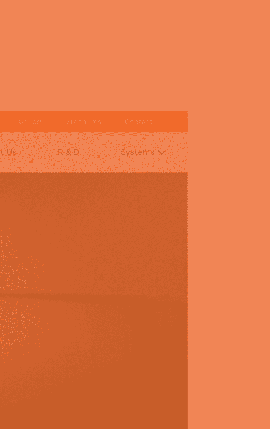
The top orange bar offers quick access to high-utility tools like brochures, gallery, and contact, mirroring the actions of returning or procurement-focused visitors.
The main navigation focuses on deeper brand understanding: home, about, R&D, and systems. This structure mirrors how users navigate in the real world.
This approach simplified user flows, mirrored the way customers interact with physical sales brochures, and ensures that both technical professionals and decision-makers can find what they need, quickly and confidently.

Learnings
Development Disconnect Hurts the Final Product
Some post-handoff changes by the dev team altered key visual decisions especially page transitions and animations. I learned that even informal contact with developers can protect design intent; something I’ll always prioritize going forward.
Progress Over Perfection
Looking back, I see areas I could have improved. But I also recognize that I successfully captured the client’s story and values, which mattered most.
Embed Yourself in the Brand
Visiting the factory shaped every design choice, from gradients to layout rhythm. Nothing replaces real-world immersion.
Design for Two Worlds
I learned how to serve both technical experts and business stakeholders, two audiences with very different goals. Dual navigation became the key

